2u Creative — Amy Morelli — Illustration — Branding — Graphic Design

Our unique Save the Dates were featured in Orlando Wedding Magazine!

AmyComment
When planning for your wedding its important to put some thought into your Save the Dates. Not only do they provide all of the pertinent information for your guests, but they set the tone for the entire event. Showing personality and creativity from the get go is a great way to get your guests excited for the big day!


In the Spring/Summer 2014 edition of  Orlando Wedding Magazine, unique and "Off the Beaten Path" Save the Dates were featured, and we were honored to have been included in the fabulous collection that they put together! 


The 2u Collection Save the Dates that were featured (in the top right), have a fun surprise element to them by displaying event info on die-cut, satin tied circles. This design ensured that the excitement of the event would keep on coming!!


Color Inspiration - Navy Blue Nuptials

AmyComment
The color Navy Blue has come a long way from the mens sport coat. In fact, in the world of weddings it has been found in much more than menswear. The flowers, the decorations, and even the cake have been found to be sporting this traditional yet fun color.

This All-American color pairs really well with other colors and looks especially brilliant next to white. With its naturally sophisticated vibe, adding a fun pop of pink or teal results a fun yet refined color palette. Using Navy Blue in the form of stripes or polka dots can creates a perfectly preppy feel.


{Photos Courtesy of 1. Heyweddinglady.com 2. Floridianweddings.com 

The 2u Collection was featured in Grace Ormonde!!

AmyComment
We are so ecstatic to be featured in the October issue Grace Ormonde Wedding Style Magazine!! The 2u Collection's design was included in a highlight of Classic, Modern, and Avante-Garde invitation designs.


Grace Ormonde Cover - October

The design chosen for the feature was for a December wedding that was filled with Holiday Cheer! With a beautiful Red and Grey Chevron Letterpress and festive touches, such as ornament escort cards and glittery red table numbers, the designs hinted at the Holiday Season while maintaining a classy and elegant look.


 Click Here for the full blog post on this event.

We are so honored to be recognized amongst such amazing nationwide talent! To see the full issue, it can be downloaded from the iTunes store via iPhone or iPad here


Inspiration Series - Greenery Productions 25 Years and Growing Together

Amy3 Comments
We are always asked where we gather inspiration for our designs. Often times our subconscious collects creativity and information from the world around us. This is why surrounding ourselves with talented people is so important. One such group of people is the wonderful team from the Greenery Productions, led by the team of Linda Grier and Tommy Murphy. The company has provided a great deal of inspiration for those in the industry over the past 25 years, continuing to raise the bar each and every year!

Last week was the perfect opportunity to celebrate and team up with them once again for their "25 Years and Growing Together", farm to table event! The evening of appreciation was held at the newly opened Alfond Inn in Winter Park, FL and included many wedding vendors that have had long time relations with Greenery Productions. After cocktails in their spacious courtyard, the guests sat down to enjoy an Alfond Inn dinner at the beautiful farm inspired tablescape. The menu included a First Course of Spinach with Goat Cheese, Candied Walnuts, and a Sherry Vinaigrette. Followed by Braised Short Ribs, with Silky Potatoes, Root Vegetables and Beef Jus. And for dessert coffee, tea and the chef's finest pastries were enjoyed.


Tracy Marini of Eventfully YoursThe 2u Collection's Amy Morelli, Tommy Murphy of Greenery Productions, and Brittany Sobering of Tickled Pink Brides


In correlation with the farm to table concept, the tablescape was designed with distressed woodland boxes, lanterns made from old screen doors, candles, organic herbs, unique florals of Crespedia and Scabiosa Pods, and even tomato and kale plants. The elements created a classic and elegant farm backdrop for the evening.


Our own Amy Morelli of The 2u Collection joined forces with other local event vendors to help prepare for this exciting anniversary. Special thanks to Tommy Murphy of Greenery Productions, Jane McLean - Director of Social Catering at The Alfond Inn, Kathryn Matta - Catering Sales Manager of The Alfond Inn, Deanne Gabel - General Manager of The Alfond Inn, Sara Florio of AFR Event Furnishings, and Abby Liga of Liga Photography


The invitations set the tone for the intimate event. Shades of greens and lavender on Bamboo paper conveyed an organic, rustic feel with a hint of sophistication. 


Gold accented place cards around linen directed guests to their seats, where they were greeted with a Die Cut Bamboo menu and a gold farm animal accent. From pigs and cows, to goats and sheep, each member of the farm animal family was represented.


Menu, Place Card, and Fun Farm Animal Accent Pieces


Long time collaborators with Greenery Productions: The 2u Collection's Amy Morelli, Lisa Stoner of E-Events, Tracy Marini of Eventfully Yours, Susan Southerland of Just Events Group, Bonnie Garfield of Loews Portofino Bay Hotel Orlando, and Abby Liga of Liga Photography.


Favors included everything needed for each guest to create a farm to table dinner themselves, including herbs and spices, olive oil, and even thank you notes!


As for everyone here at The 2u Collection we are eager to see more "Greenery Productions" that are bound to be created over the next 25 years. See below for a little flair from their past!


E-Blasts In Demand

AmyComment

Here at The 2u Collection we admit that our obsession for paper is grand! Parchment, Linen, Cotton, Vellum -- Textured, Matte, Mylar, Foil -- the Weight, the Color, the Feel... all just absolutely fascinating.  However, not always does an occasion call for a “physical” invitation piece.  
Enter the E-Blast Invitation!! 
Recently and in partnership with our branding and marketing division 2u Creative, we have seen an upturn in our development of not only E-Blast Invitations for clients, but also E-Newsletters and additional email based marketing materials.

While we have a natural passion for paper and have gained an all-new appreciation for the flexibility of the E-Blast, it is important to understand that the E-Blast isn't always appropriate. Formal events should stick with tradition and use a paper invite that is sent through the mail. However there can still be a place for the E-Blast in even the most formal of events such as reminders to book hotel arrangements or to share an Itinerary.

Here are some examples of great times to use an E-Blast:
  • A last minute event pops up and you have limited time to send the invites
  • You’re working within a budget and your event doesn’t call for a formal invitation
  • The invite or information needs to be sent to a large mass and quickly
  • A time sensitive promotion your clients would love has begun and ends soon
  • Going GREEN and decide this will cut down on paper costs

Take a look below and see how E-Blasts can be effective yet styled, in a variety of forms:


Bachelorette Party


Wedding Reminder


Rehearsal Dinner


Promotional Newsletters


Party Invitation


Additionally, E-Blasts created by The 2u Collection and sent through our email marketing system, can provide several useful features including:

  • Email reports and tracking results
  • Insight on how recipients marked your email (spam, subscriptions, relevance)
  • Feedback regarding client interests and targeting techniques
  • Matching your e-blast branding to your website branding
  • Financial, economic and environmental advantages

Color Inspiration - Mint Madness

AmyComment

This cool hue is all the rage!! While it does great as a stand alone hue, combining it with other fabulous colors can take the feel of your event anywhere from soft and vintagey, to bold and edgy. Choosing a second color will allow you to make the Mint your own.        


Mint & Cool Blue emits a serene and romantic feel.


Mint & Lemon presents citrusy sophistication.


Mint combined with pretty Coral & Pink provides a pop that shouts summer fun!


For an edgier feel, team up your Mint with Navy.


Either route you choose to take will leave you feeling minty fresh!!


Correspondence with Flair

AmyComment

Recently we addressed the importance of keeping the handwritten thank you note alive.  As we worked on embellishing Invitations, Holiday Cards, and Thank You’s throughout this busy season a thought evoked… writing can be mundane BUT embellishing is always an inspiration for excitement, for both the giver and receiver.

So the next time you sit down to write a letter or feel uninspired consider the following ways you can spice it up… add a touch of character… and express your personal style!  You might find that looking forward to the details may awaken the purpose of your correspondence and even influence a theme.


Embossing Press
In creating various stationery projects for our coveted client Florida Hospital, we were inspired to design this embossing press featuring the Florida Hospital logo.  The result was a piece of class!  We loved the touch so much that we designed a piece for ourselves here at The 2u Collection and we just couldn’t stop pressing our logo onto all types of surfaces once we received it!! An adornment like this can be customized with a logo or graphic to fit most any need! - Check out theStampMaker.com


Envelope Enhancements & Pristine Packaging 
Envelope liners, wax seals, color corrugated shipping boxes and custom designed labels add a unique elegance to any mailing!

Courtesy of TheWeddingPhile.Blogspot.com

Gorgeous envelope liners can be found for almost any size at Paper-Source.com - From solid colors to fine prints, liners add that finishing touch... much like a fabulous lining on a tailored jacket or cuff!


Something as simple as changing the color standard on packaging can really act to catch the eye.  Give the brown box a lift and go for a bold color, or take it a step further and choose unique shapes and sizes.  Take a browse around USBox.com for a plethora of packaging!!


The timeless wax seal needs little explanation...  It's clean, elegant and speaks volumes as you seal each envelope with care and sincerity.  At Nostalgic Impressions they create polished & personalized wax seals that make us swoon!


A Pop of Color... A Taste of Texture
Colored envelopes and textured papers will change the entire feel of a correspondence piece while adding impact to that stack of junk mail! Even here at The 2u Collection our eyes spark and open wide when we catch a rouge within the pile... and of course, it's the first we chose to open and admire!!


Have you ever experienced that moment when writing or creating a thoughtful piece, where you just couldn't wait for the recipient to open?! Oh the anticipation!!! Well, there are times when the excitement is all too much and you boldly take an unconventional approach, much like that featured above. This client was so full of joy in announcing their new edition, that they simply had us print a lovely portrait right on the envelope -- Secrets Out!!


As we sift through the mail texture stands out to the touch!!  The columned paper featured above is sure to impress.  Play with different paper types and treatments to evoke a variety of feelings.  Neenah Paper is one of our favorite paper pros but check out Paper Mojo as well for decadent handmade papers!


Stuck & Stamped
Both of these are cute and quirky ways to add a bit of personal whimsy & cultural flare! -- You can layout, design a nice label & stamp or print right on the envelope.

Courtesy of IntimateWeddings.com

We just love this! Try buying stamps in small denominations and then placing them creatively on the piece to create a fun and traveled feel. Pick up stamps as you explore the world or hometown. Check out vintage and antique shops... alot of the time they'll have these treasures tossed amongst old photos and such!


Courtesy of GourmetInvitations.Blogspot.com


A custom ink stamp like the one we created above not only acts to adorn a mailing piece, but it can also be held as a keepsake and used time and time again on a variety of creative indulgences.  - OrlandoRubberStamps.com produced our design flawlessly!


In hopes that you are inspired to create!!  For more ideas visit us on Facebook at The 2u Collection

Anne & Scott say I DO with Simple, Romantic, Elegance

Amy1 Comment
Onsite Prep Photography:  The 2u Collection     Event & Studio Photography:  Liga Photography   Invitations & Stationery:  The 2u Collection    Venue:    Loew's Portofino Bay Hotel        Videography:  Imprint Cinema     Floral, Decor & Linens:  Botanica International Decor & Design Studio     Officiant:  A Beautiful Ceremony     Cake: The Sugar Suite      PhotoBooth:  Click! Photo Booths   Entertainment:  The Buzz Cats      Design & Coordination: E-Events Design by Lisa Stoner     Draping:  Swag Decor


We always love to tackle a project, where there are no design limitations. It's every designers dream! And I am no different! It's extremely fulfilling to my creative brain, when I get to present out of the box unique ideas and the client not only trusts my judgement but is open to the non traditional. When I met Anne and Scott early in 2012- it was a breath of fresh air!

From the first design brainstorm meeting over skype with the bride, her mother and Lisa Stoner from E-Events to the last minute pieces we pulled together at the end- this couple (and family) was a joy to work with!  We were hired for full service Stationery and art direction of all media (printed pieces, logo projections, etc).  I am often asked what full service custom stationery entails. And this is the perfect wedding to explain it. Basically, I am at the clients beckon call for anything and everything in regards to graphics, stationery, websites, staging, etc, from the moment they book me to the day of the event,  and any last minute designs or pieces that may be needed as the event grows near.

This also includes being there during the event set-up to support E-Events and other vendors with regards to the graphics, stationery, etc. Many times the designs I create can be elaborate and often include various working parts and pieces. In these cases, we offer full service as to not burden the coordinator and other vendors with the tasks of having to set up our complex pieces. I always love it, because then I get to see the bride and grooms reaction to our work... we often don't see their reaction first hand, because most of the time the stationer isn't needed onsite during event set up.

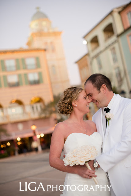
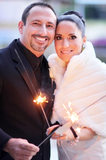
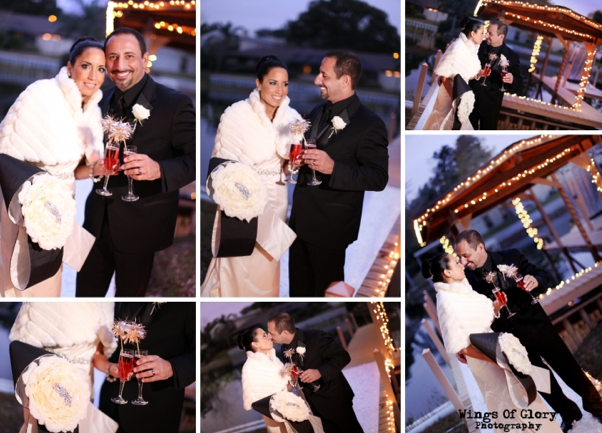
So here we go! Let's start enjoying these details! When I first met this couple, I was told... NO FRILLS, and Nothing TOO FORMAL or  GIRLY. The bride and groom both play soccer and are pretty laid back -- and wanted their wedding and wedding stationery to reflect that, creating a mood of close-knit, family warmth and comfort.

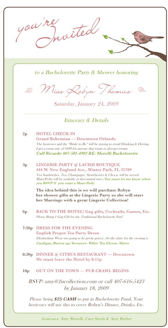
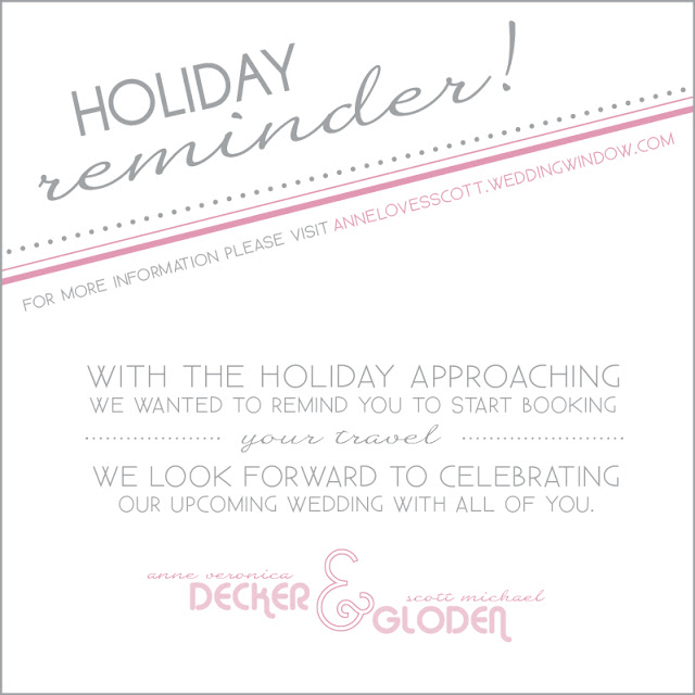
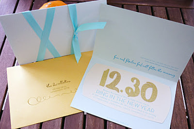
Since their wedding was over a holiday weekend, they wanted to ensure that guests weren't shut out of booking rooms due to the holiday weekend. So we sent the above eblast to the guest even before invitations when out!


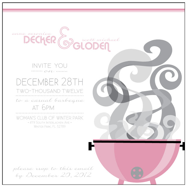
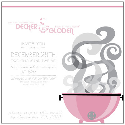
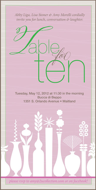
Next on the agenda... Rehearsal Dinner, again an eblast was sent inviting guests to the night before the wedding festivities. In this case it was a down home cookout!

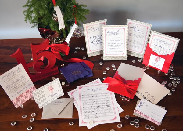
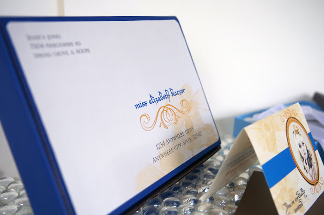
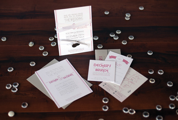
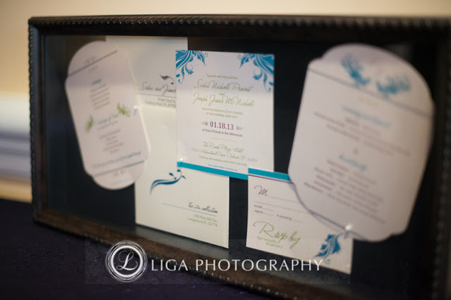
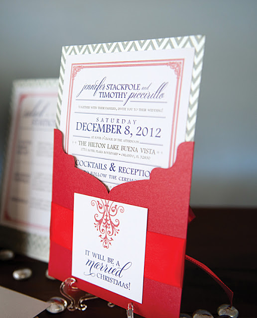
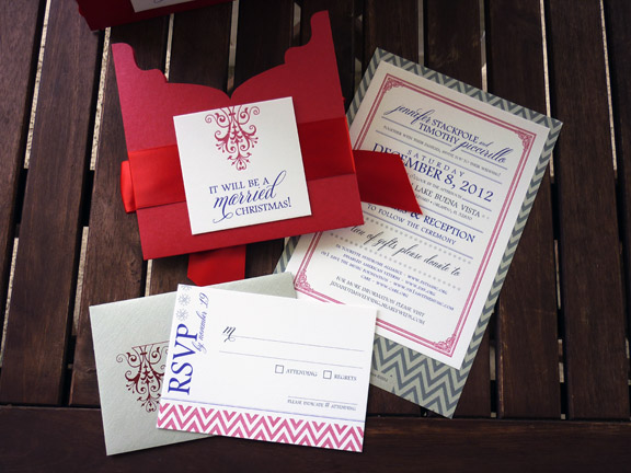
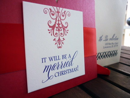
The invitations were next to arrive in the post and give the guests a bit of excitement for the event ahead.
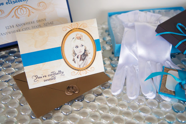
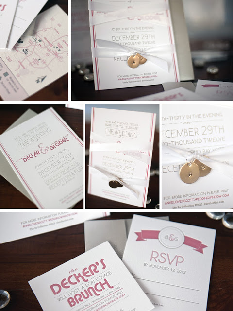
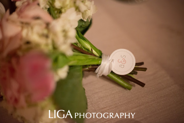
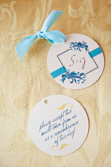
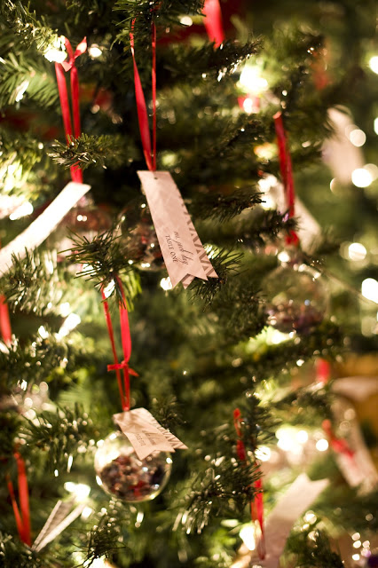
Super thick 130# felt paper with 2 color letterpress bound together with a white satin ribbon and silver flat charms with their initials punched into them. We developed a monogram for the bride and groom, that you will see throughout the whole event! 

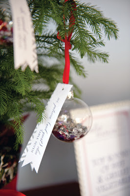
Take in some of the details of the invitation below.

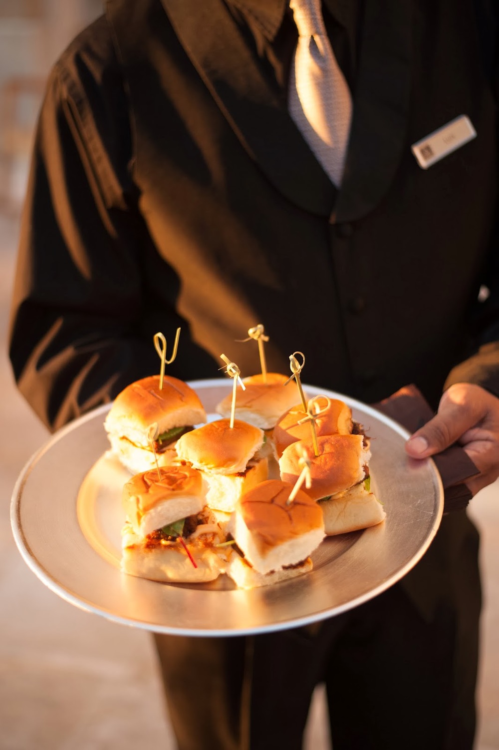
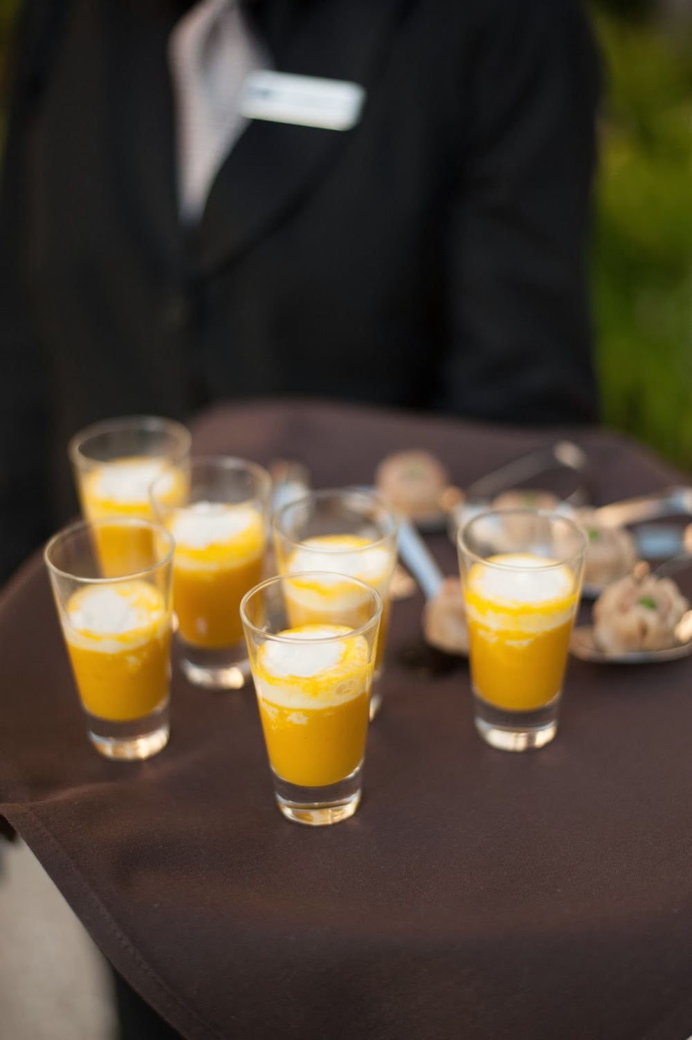
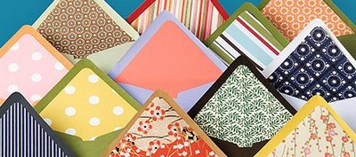
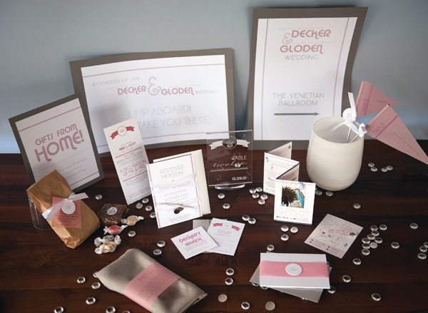
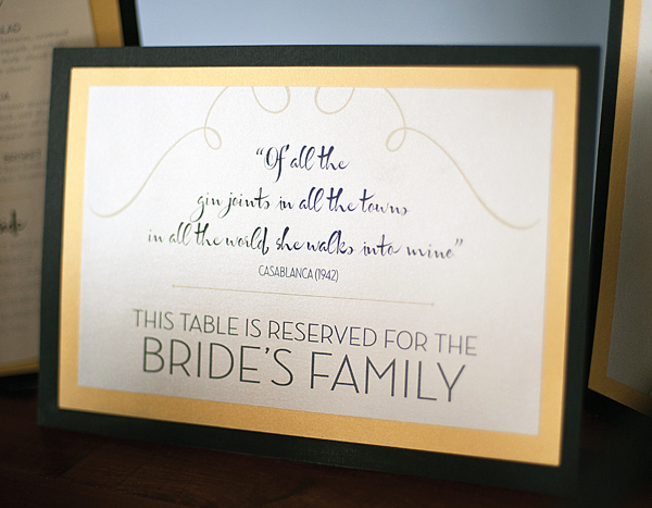
We did all kinds of wonderful stationery for the event itself. Below you can see the whole group, and 
I'll discuss each detail below as I share the amazing event with you.

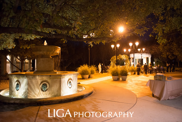
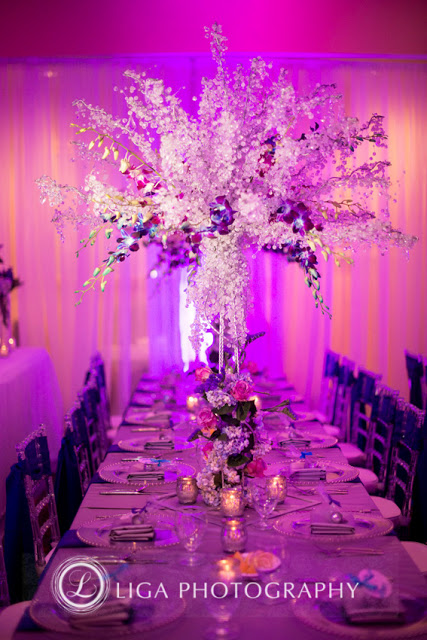
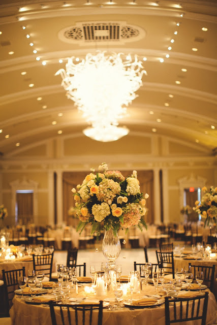
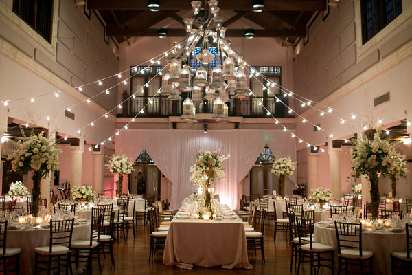
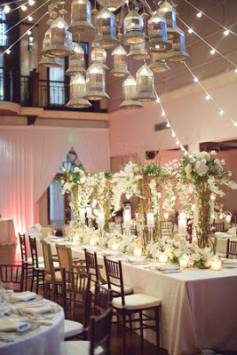
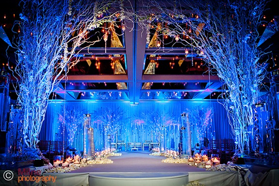
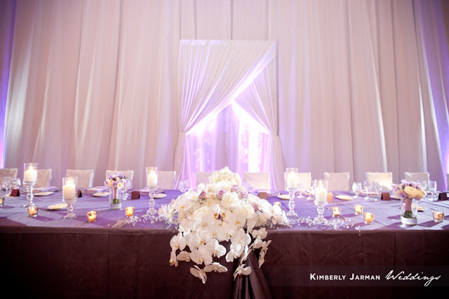
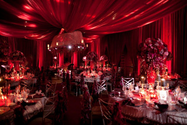
I am always amazed at how an ordinary ballroom can be transformed into an amazing oasis, and this wedding is no different. Lisa Stoner from E-Events outdid herself this time!! (and every other time.. lol) And of course the full team that was pulled together all did their part to create this amazing event. (see credits in the top of the blog)
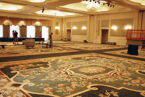
BEFORE (above): Loew's Portofino Bay Hotel  --Venetian Ballroom. This is event day around 10am. Vendors are starting to arrive, the room has yet to become it's destiny! 
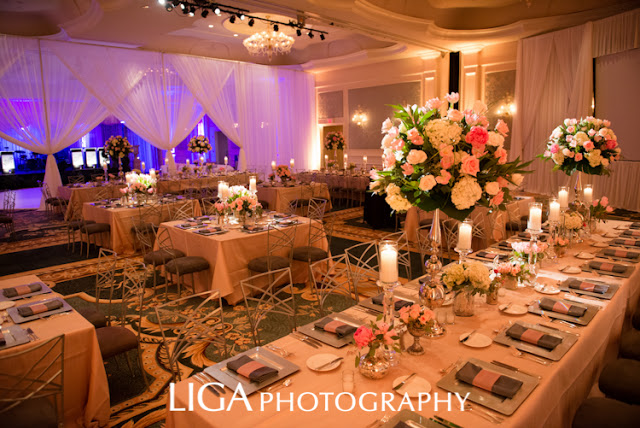
 AFTER (above): Loew's Portofino Bay Hotel  --Venetian Ballroom. This is event day around 6pm. What an amazing transformation! Props to Swag Decor and Swank A/V at Loew's Portofino Bay Hotel, 
 the draping and dramatic lighting really changed the room!
Loew's Portofino Bay Hotel  --Citrus Piazza. The couple exchanged vows under the stars.

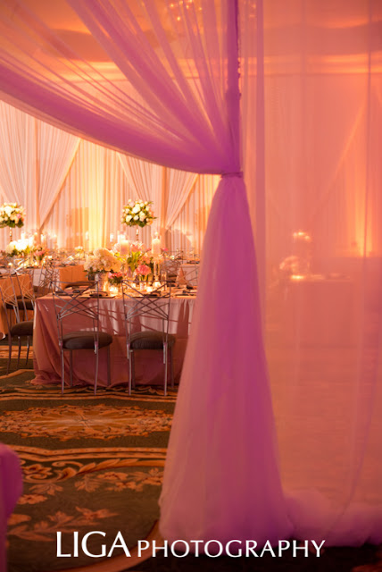
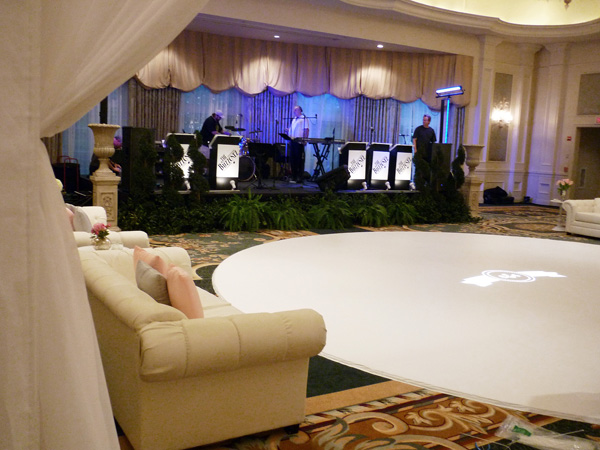
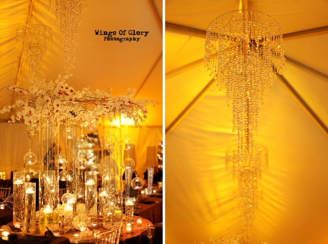
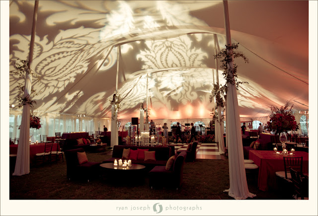
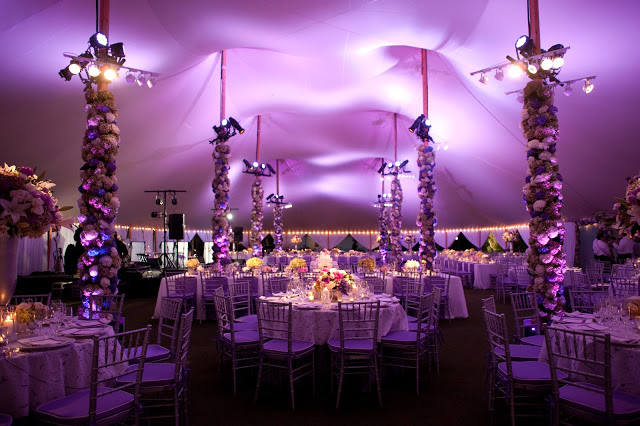
Lisa created a divided room, with drapes and dramatic lighting, so there was a dinner area and an entertainment dancing area. Beautiful White Leather Furniture surrounded the ROUND dance floor- that's right.. ROUND.. What an amazing touch!
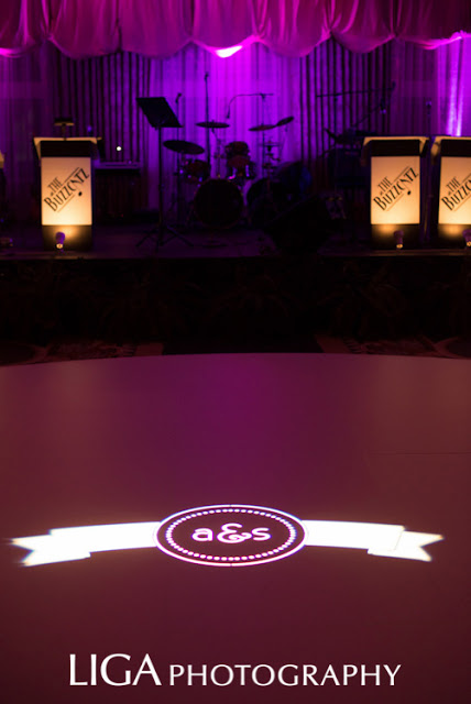
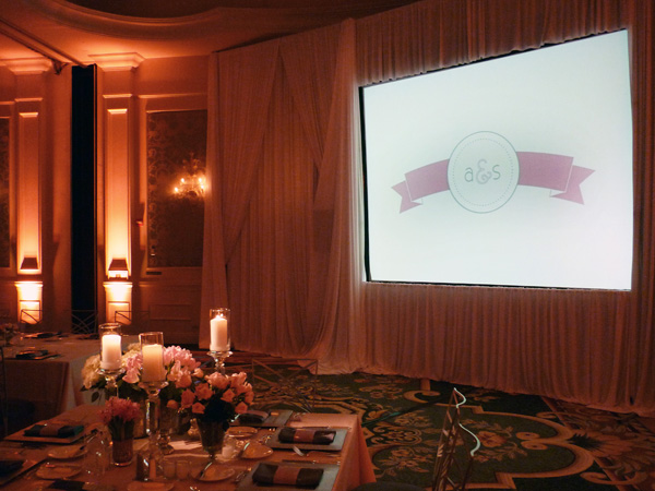
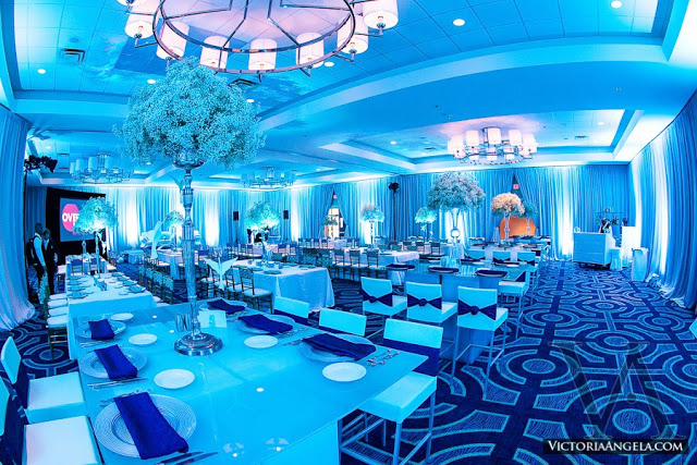
The room also had a large movie screen for a slideshow during dinner. We created our monogram graphic for both, to carry the stationery and monogram theme throughout. Below you can see the light projection on the dance floor above, with a close up below, as well as the screen projection graphic.

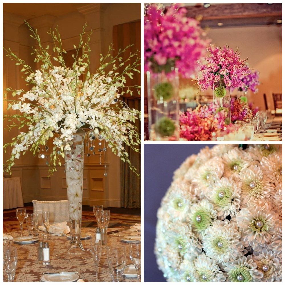
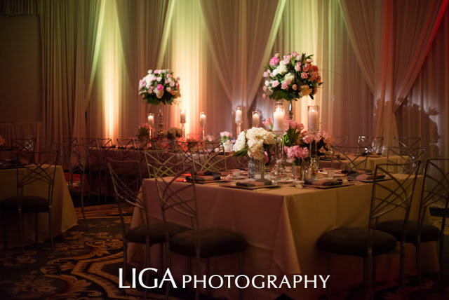
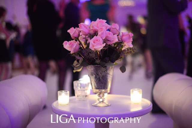
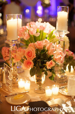
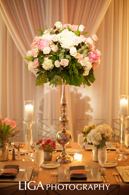
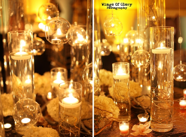
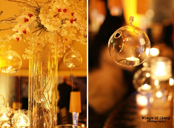
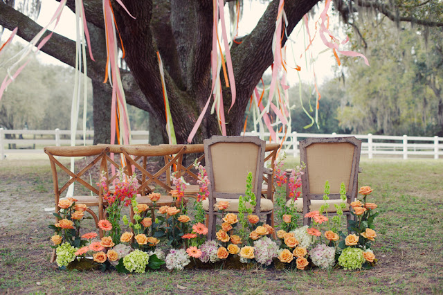
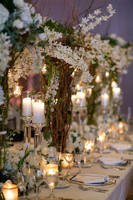
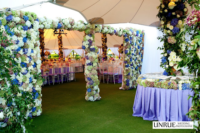
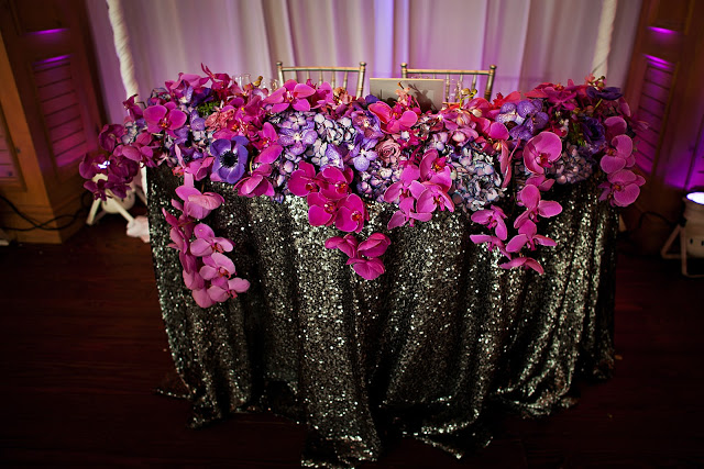
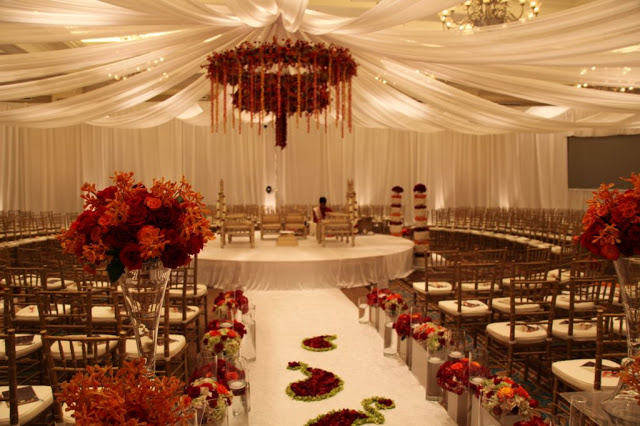
Before I go too much further, I have to give props to Ian Prosser and his team at Botanica International Decor & Design Studiohis decor and floral really made this event romantic and elegant!  Checkout some of my favorite details of the 
decor below.
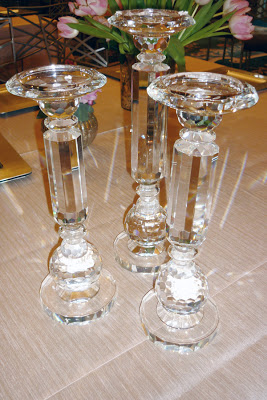
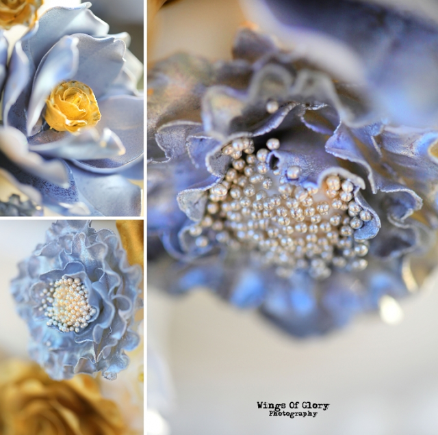
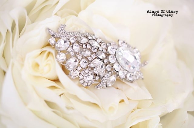
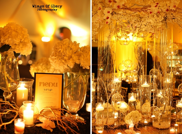
These crystal candle sticks... SWOON.. I told Ian at the event he needed to keep an eye on me, because I wanted to take them home!!  As you can see his floral and decor design, really added romance and elegance. Creating the warm and cozy family feeling the couple were looking for.
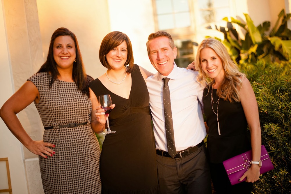
 Lisa and Ian! On Event day.. working hard, but always time out for a little vendorly love!
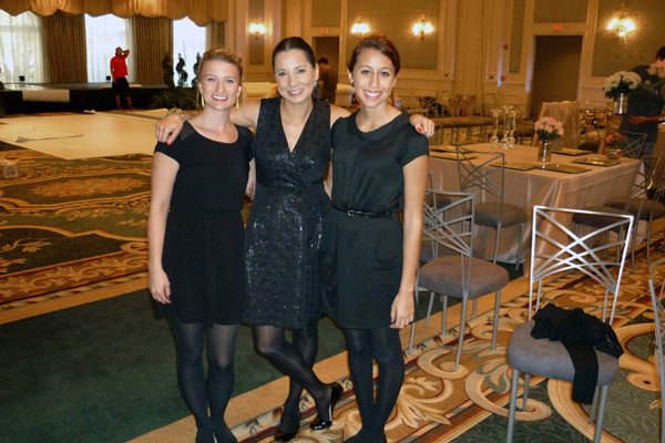
 Lisa (center) with her E-Girls! On the Left her future sister-in-law, Jessie Carr. (Soon to be Stoner!) And on the right, her beautiful daughter, Sara Konency.

Now, Back to the stationery! I wanted to set the stage for the remaining pieces we created. As I mentioned earlier, the couple and the family of the bride, were a joy to work with, and they trusted the vision of all the vendors involved and handed us the reigns to do the best job we could! With this in mind, I did some creative thinking and created some pretty unique pieces. 
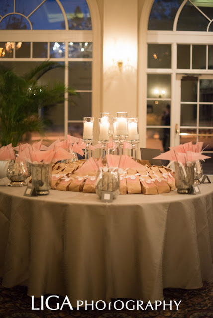
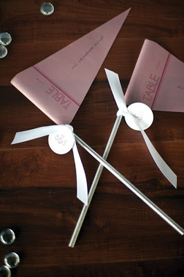
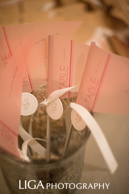
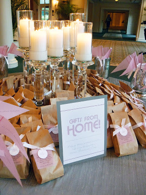
Guests were greeted when they arrived after the ceremony to cocktail hour, where they found this escort card/favor table.
Because the bride and groom are both avid Soccer Players, we created Dusty Rose Vellum Pendant escort cards. And once the guest took they their pendants, the mercury glass vases were cleared leaving the center of the table filled with 
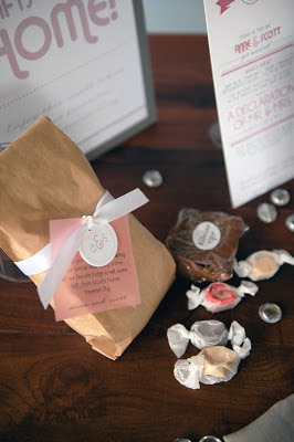
"Gifts From Home" as take away favors. 

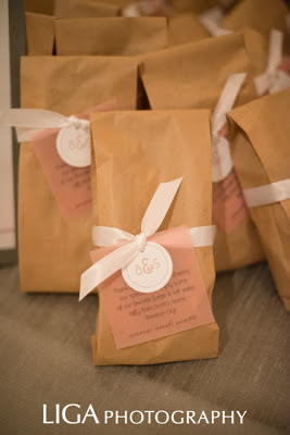
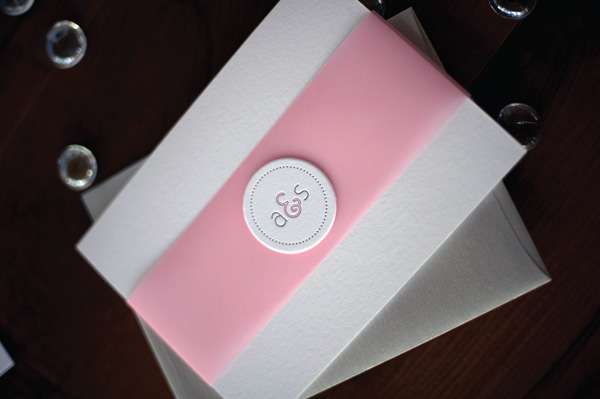
Dusty Rose Vellum Pendant escort cards with letterpress monogram button tag and white satin ribbon, on metallic silver 
dowel rods! Below:Details of the Gifts from Home!  The groom is from Traverse City, Michigan. A place know for Kilwins Fudge and Salt Water Taffy. The couple decided to share a bit of home with the guests with these great snacks! Assorted Fudge and Salt Water Taffy in a brown kraft bag adorned with a letterpress monogram button, white satin ribbon and a small note from the bride and groom, also on Dusty Rose Vellum.

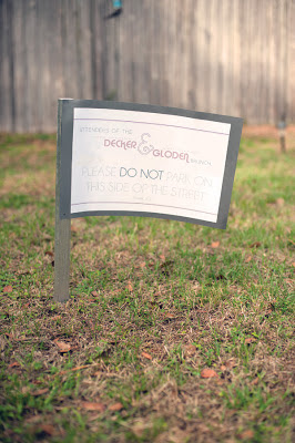
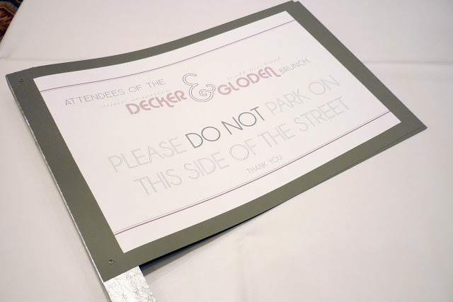
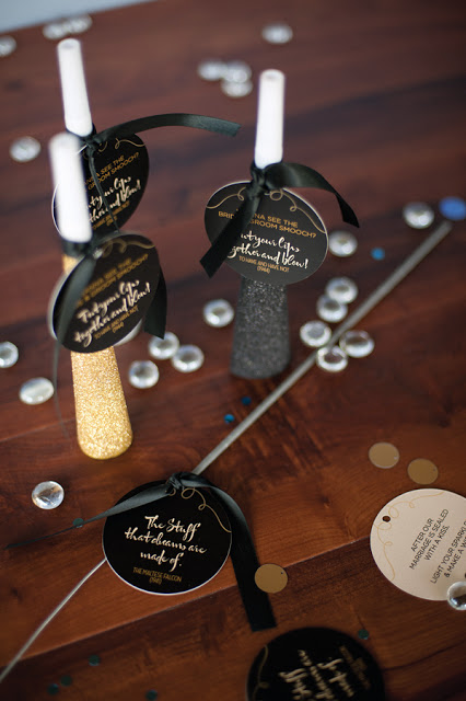
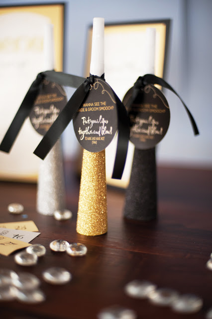
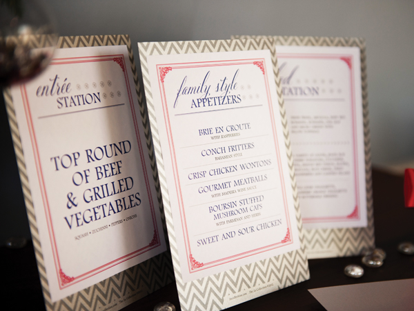
We also created signage that sprinkled throughout the event for various things, The Photobooth, the Bar, Directional Signs, etc. We even created yard signs for their day after brunch, which directed guests where to park! These signs were on Dark Grey Paper- with white felt mounted with the message.
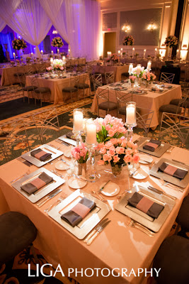
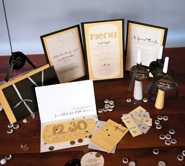
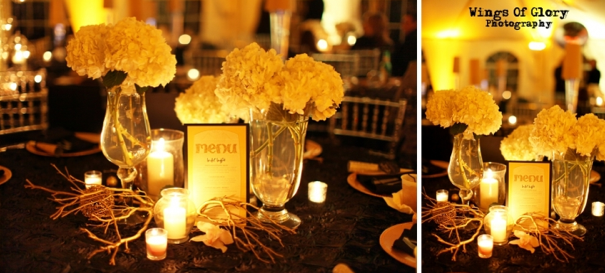
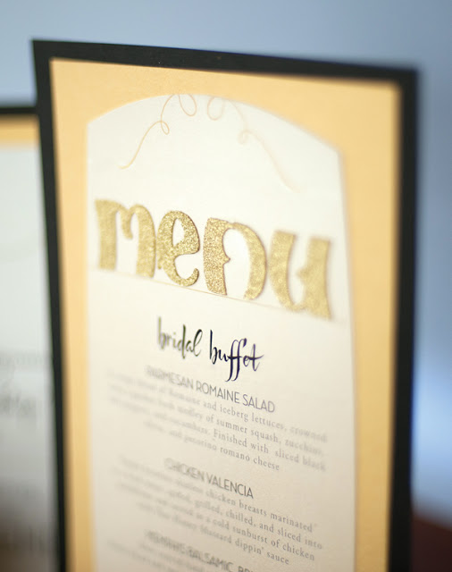
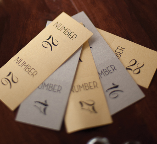
As you read above I am gushing about the design, decor and floral of this event. With that being said, the pieces I designed for my contribution to the decor were Acrylic Table numbers and Vellum Belly Band Menus. I didn't want to disappoint, as I knew these pieces I created would be showcased on the tables with all the other amazing decor. To this end, I wanted to design elements that were strong pieces on their own, as well as lending to the overall atmosphere that Lisa was trying to create. These pieces needed to be not-too-showy, while still complimenting the other elements in the room.
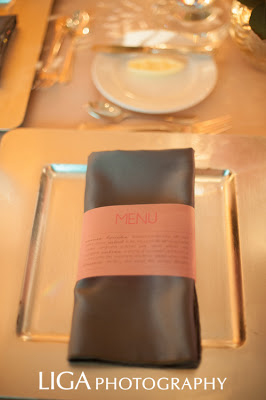
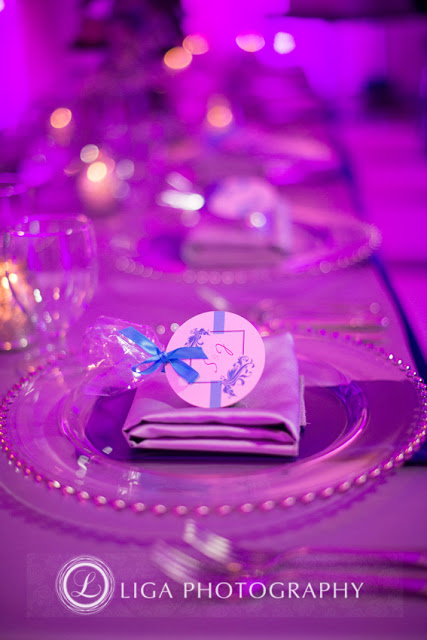
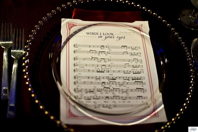
                   Dusty Rose Vellum Belly Band Menus- wrapped around the silver silk napkin resting on the plate.
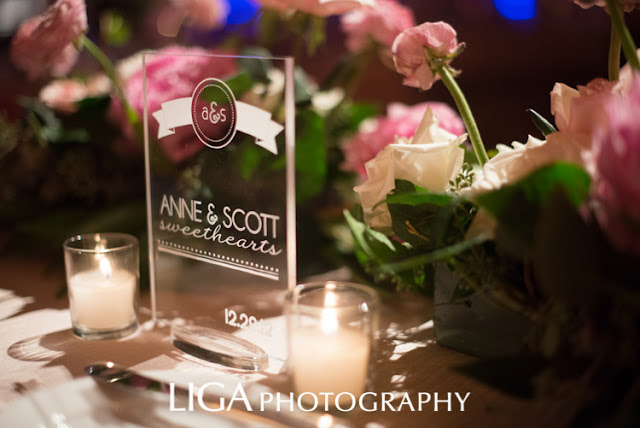
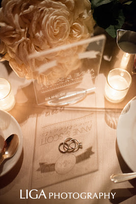
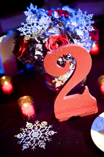
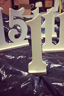
 One of my favorite things from this entire event... Acrylic Table Numbers!! We created these beautiful Acrylic Table numbers for each table, the bride and the grooms sweetheart table got one as well, as a nice keepsake for years to come!

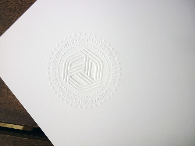
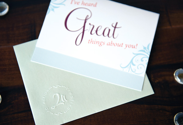
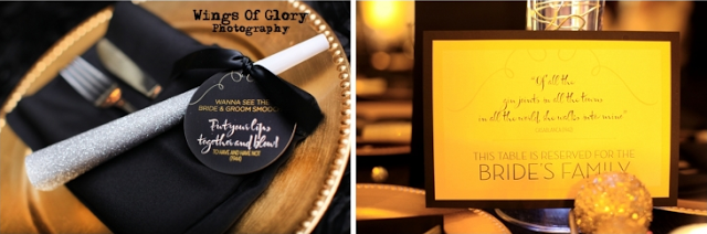
These great Letterpress Monogram Buttons we created for various applications throughout the event.
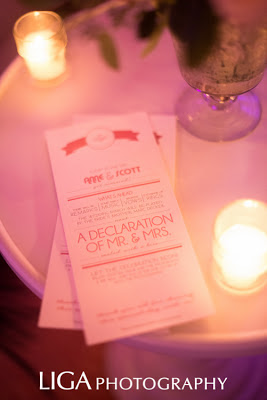
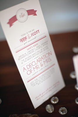
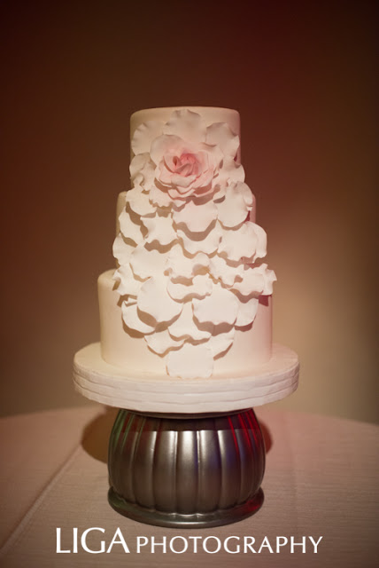
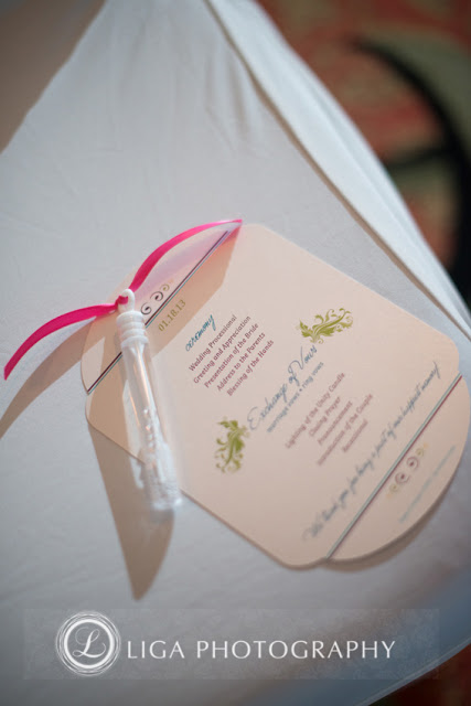
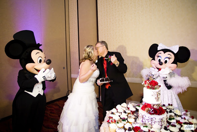
 Because this couple was so NON-FORMAL, we did a fun program, that gave a fun overview of the ceremony. I also want to give some love to The Sugar Suite as this is one of my favorite cakes from ALL OF LAST YEAR!!

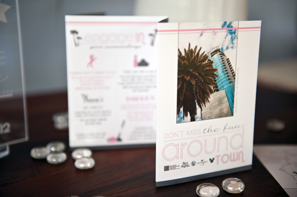
Last minute, the family decided they wanted to put a brochure and map cards in the hotel rooms for guests, so they knew of holiday events around town, dates, times, phone numbers, directions etc. Below is a 8 Panel Accordion brochure that gave the guests all the information the needed for holiday events, shows, etc. happening locally.
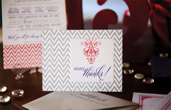
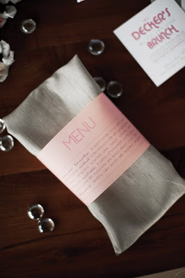
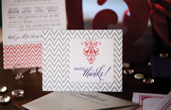
 The Thank You: Dusty Rose Vellum Belly Band with Letterpress Monogram Button mounted, inside, letterpress thank you message from the bride and groom.

In Closing- we are proud and thankful to have been involved in this event from the smallest detail to the large! This is what the bride and groom had to say:
"Well what can we say?  The wedding was amazing and everything we could've imagined!  Thank you thank you thank you. All of your ideas were creative, fun, and also personal to us."
--love anne and scott


2012 Holiday Season Series- New Years Glam, Old Hollywood Style

AmyComment
Event Photography: Wings Of Glory Photography     Studio Photography:  Liga Photography   Invitations & Stationery:  The 2u Collection    Venue:  Ronnie & Will's home on Lake Brantley       Videography:  Key Moment Films     Tent:  Classic Tents & Events     Floral:  Lee Forrest Design & Pink Flamingo at Petals     Officiant:  A Beautiful Ceremony    Chairs: A Chair Affair      Linens:   La Tavola Linens       Furniture:  Hitched Event Rentals       Hair / Makeup:  Kristy's On-Location Makeup Artistry & Hair Design      Cake: Anna Cakes      CupCakes:  Pink Pig Bakery     PhotoBooth:  Click! Photo Booths   Entertainment:  Carrara Nour      Design Collaboration & Execution: E-Events Design by Lisa Stoner      Desserts:  RW Couture Chocolate Fountains     Dress: Solution’s Bridal, Orlando     Tuxedo: Absolutely Fitting      CatererMoore Fine Foods     Draping & Chandelier:  Swag Decor


We at The 2u Collection we have been reminded how fun it is creating wedding stationery for one of our own in the industry! What you may not realize is that working in the wedding industry doesn't necessarily make planning and executing your own day much easier. In fact, knowing the ins and outs of your vendor's capabilities can sometimes create option overload! Such is the case with fellow vendors Ronnie Renaud and Will LaValle of RW Chocolate Couture Fountains & Decadent Desserts! and Click Photobooth Rentals. This wedding was a while in the making, as great business owners, they kept postponing to put the needs of their brides weddings ahead of their own. 

   
The original inspiration was driven by the fact that the bride hadn't really decided what kind of wedding and experience she wanted to create. So we brainstormed and thought her invitation could be her "something blue"! And of course we didn't want to ignore new years, so Pale Blues & Dazzling Golds, Gleaming with Glitter and a Sprinkling of Iridescent Confetti are just some of the ideas we landed on! Then as her dream wedding design started to take shape. Thanks to Ronnie's collaboration with Lisa Stoner of E-Events Design this amazing Old Hollywood Glam Wedding started to materialize. Ronnie had underestimated her guest list, and once the "Something blue New Years Concept had gone out, she realized she was going to need about 50 more. So we took the existing design and turned it Hollywood Glam. 
And to make the project a bit more challenging, due to the need for quick turn around on the second round design, we weren't going to have enough Glitter Die Cut Letters. So we took the challenges In stride and created the above "Mix and Match Idea of the same invitation!"

Side by side the invites are reminiscent of one another, but when you take a closer look the individual delights of each begin to stand out. It even becomes a playful way to engage your guests and get them talking! Without competing these pieces have managed to create a "Which one did YOU get?!" buzz while lending the same feel to the overall creative concept of the wedding event.

Abby Liga of Liga Photography, the fabulous bride Ronnie Renaud, Amy Morelli of The 2u Collection and Lisa Stoner of E-Events Design
It's always fun working a wedding for a "Friendor" because getting to be a guest and a vendor is a good time! Blowing off steam with the people you have been working hard with for months  makes for a little personal connection with people in the industry.

As the decor and the Old Hollywood theme started to reveal itself, I dove into the Paper Design using sparkly linens, our glitter invitations, chandeliers, beading and drape as inspiration. I tried to imagine a New Years Eve party, circa 1940s-50s old hollywood movie. We started by finding old Hollywood movie quotes from movies that would be appropriate for some of the pieces we were creating. These quotes were peppered throughout the stationery on various tags, signage, etc. 

Having worked with almost all of these vendors before, we all are accostumed to each other's design style, so as I was designing I was trying to image what the wonderful Lee Forrest would do, Swag Decor, etc. How would my paper add to the overall design of the event?  Enjoy some of the details that sparked my creativity. Above: Disco Balls by RW Chocolate Couture Fountains & Decadent Desserts sparkled in the Signature Gold and Silver of the Event. 
Die Cut Gold Glitter Letters shined in candlelight on these unique layered paper Menus we created. Black Soft Touch Paper layered with Gold and Champagne Metallic added another luxurious detail to the table centerpieces. 
Disco Balls Hung from the Bar and Dancing Tent, While Chandeliers hung from the trees and Dinner Tent. Guests were WOWed at every turn of Ronnie and Will's lakeside yard, From the silk and beaded drape, to the details below. New Year's Eve was in the Air!
During Cocktail Hour, the guests used silver and gold paint pens to sign Ronnie and Will's keepsake magnum of red wine. We created a Gold Foil Label for the magnum, Raffle Tickets for a "Singles Game" were also found on the welcome table. There are also some sparklers for the guests to pick up and use at the exit of the ceremony, but more about those later.

While the above magic was being created, Ronnie and Will were hidden away getting ready for their big moment. I want to give a quick shout out to Kristys On Location Makeup Artistry and Hair Design. They made the bride look gorgeous, and as a special thank you for my part in her special day Ronnie had them make me look fabulous as well! And did they ever, I felt like I stepped right out of one of those Old Hollywood Movies myself.
And here comes the bride...here comes the vows.
Working with Ronnie we came up with a Sparkler exit after the announcement of Mr. and Mrs. , it kept the New Year's feeling while adding the Glam factor! The back of the tag prompted guests to light the sparklers and make a wish at the couples first kiss.
Traditionally at a wedding when you clink your spoon against your glass the bride and groom should smooch. With this in mind on each plate was a gold, black or silver noisemaker, with the old Hollywood Movie Quote "Put your lips together and blow".
Traditionally at a wedding when you clink your spoon against your glass the bride and groom should smooch. With this is mind on each plate was a gold, black or silver noisemaker, with the old Hollywood Movie Quote "Put your lips together and blow".
I'm going to leave you with a few more of the amazing details from the evening below, and of course Ronnie and Will's dog Murphy made an appearance! He's just too adorable to leave out. 
Above flower cake details. Below an amazing brooch embellishment for the bridal bouquet.


Wish Upon a Wedding...Wishing this couple the happiest of futures!

AmyComment
A few months ago, I was asked to join the Wish Upon A Wedding team, a non-profit organization granting weddings to couples with terminal illnesses.  After hearing Sasha and Joe’s story and learning of Sasha's battle with terminal breast cancer, I started designing!


Event & Studio Photography:  Liga Photography   Invitations:  The 2u Collection    Venue:  The Rosen Plaza  Videography:  Treasured Moment Video Ceremony Music:  Christine MacPhail   Floral:  Unforgettable Events  Officiant:  A Beautiful Ceremony   Cocktail Hour Music:  The Edge Effect    Linens:  Over the Top    Chairs & Centerpieces:  A Chair Affair   Hair / Makeup:  Marigold Scott    Cake:  Party Flavors    Lighting:  Soundwave Entertainment   Entertainment:  Carrara Nour    Planner:  Terry Smedley & Brittany Ellis  Favors:  RW Couture Chocolate Fountains


Sasha and Joe have been together for 8 years and share 5 beautiful children together. Their one wish was to get married with all of their family and friends baring witness. I am truly honored to have had participated in such a heartfelt occasion. 
Sasha found a design she like from Paper Couture Stationery our Limited-Edition, Ready-Made online boutiquebut I wanted to jazz it up a bit for her special day, so we altered the design slightly, using her wedding colors, adding a bit of sparkle with crystals and die cutting to the programs!
These great favor tags were tied to Disco Balls by RW Couture Chocolate Fountains! If you have ever read this blog before you know, one of our guilty pleasures, is ANYTHING from RW Couture Chocolate Fountains, but I must confess, the DISCO BALLS I LOVE LOVE LOVE!!!!
We are so proud to have been a part of this, as well as honored to work along side everyone else involved! Revel in this touching event below with the amazing images by Liga Photography and the video by Treasured Moment Video.


2012 Holiday Season Series- A Musical Marriage with a Festive Flare.

AmyComment

Vendor List: Studio Photography: Liga Photography  Events Consultant: An Affair to Remember- Lisa Bowen Venue: Hilton Lake Buena Vista Event Photography: Jennifer Werneth Photography  Video: Lucky Lemon Films  Hair: Chloe Black Pure Aveda SalonSpa  Makeup: LeJeune Artistry  Lighting: Kaleidoscope Event Lighting  Draping: Quest Drape  Linens: Over the Top Rental Linens  Chargers: A Chair Affair  Floral: Vintage Vines  Ceremony Music: Bella Strings  Cocktail Music: Johnny Norton 
Reception Music: The Buzzcatz  Cake: Cupcake Crazy


This past holiday season Love was in the air. 2012's holiday season brought us many opportunities to witness the commitments of marriage. This first installment I want to share with you was for a couple that, like me, are creatively minded artists. I don't have to tell you that made it alot more fun in the collaboration of the stationery. 


Jen Stackpole and Timothy Piccirillo were such a fun couple. Jen is a songwriter/singer and Tim has been dazzling people with his impeccable magic and uproarious comedy for over 25 years. Be sure to check out some of Jen's Music, I have her album playlist later in the blog. 


Working mainly with Jen and Lisa Bowen from An Affair to Remember, she gave us a color combination and pretty much complete creative freedom. Which is always fun, because in the initial design process it means no ideas are off the table! As I always say, invitations set the tone of the entire event, so course, that is where we started. Details became the main inspiration for all her stationery, using Chevron Prints, Letterpress Accents, Metallics, and a Bold Color Palette that would exude a festive flare with sophistication.

Pulling it all together was an elegant Die Cut Invitation Jacket in Metallic Red for added splendor! Pushing further into the realm of luxury we went on to adorn the enclosure with a perfectly wrapped Red Satin Bow and Letterpressed Bellyband all of which would be held in a Quartz Metallic envelope to finish. I won't lie, this is one of my faves this season, it's classy and elegant with a hint of holiday flare!


Being a winter wedding, we wanted to create a design that fit the theme of the holiday without becoming.... well.... cheesy. So instead of cliche holiday graphics and icons we focused on incorporating timeless elements into the details of this piece. We hinted at the holiday season with the above concept for escort cards. Metallic Confetti and Sequins in the event colors filled crystal glass ornaments and hung on pine trees, chevron tags guided the guests to their table. Where they found the below, a 7" Inch tall Wooden Laser Cut Numbers. Glittered in Red, these numbers made a statement not only as a functional piece of the event, but as a stunning piece of decor in it's own right. 


From the Start, Jen wanted to make sure this wasn't a "Christmas Wedding". However, she didn't want to completely ignore the fact that it was the Christmas Season. We created the above logo for the invitations, but using it additionally on the cocktail napkins was a perfect way to continue it throughout the event.


Chevron Letterpress and Screen printing on Felt created the rest of the amazing pieces that rounded out this event. Here at The 2u Collection, we are always finding ways to add that personal touch to the stationery we create. In this wedding, since the bride is a singer/songwriter it seemed only appropriate that we put their first dance song on paper. The sheet music to the song adorned each place setting. As well as various station menus describing the nights delectable cuisine.


The bride was so thrilled with her event and Custom Stationery by The 2u Collection she had these things to say:
"Wow - I am completely overwhelmed by everyone's love, support and sweet comments about our wedding! Thank you all SO much! Tim and I are so incredibly blessed to have so much love in our lives!! The wedding could not have been more perfect and, the best part of it for me was, I got to marry the absolute love of my life!! SOOOOOO blessed!

Love, love, LOVE Amy Morelli and the 2u Collection!!! I can't recommend her enough! She is wonderfully creative, absolutely professional and SO easy to work with! She's the BEST! I will not hesitate to work with her again in the future and I HIGHLY recommend her!!

~ Jennifer--BRIDE ~


The VIP treatment of her guest continued through her entire wedding process, at the end of the night a special appearance was made by Mickey and Minnie Mouse, and you can see above the stylish thank you's we created showed the guests love well after the dust had settled.


Inspiration Series - Ian Prosser & Zoë Gallina of Botanica

AmyComment


am often asked how I fight through creative block and what inspires me. So, here is an installment of my Inspiration Series.

I've found that sometimes to break out of a NON-creative funk, it's best I go look at some work of other artists I admire. Being a traditional artist as well, It's fun for me to see what other artists use as their outlet, although I paint, and sketch my primary outlet for my art is through graphics, type and paper.  Sometimes to see how other creative minds put out their ideas, and the creations they create will jostle my own creative juices. All photography images courtesy of Botanica.


Featured in this installement are the unsurpassed talents of Owner Ian Prosser & Creative Director Zoë Gallina. Lose yourself below and be captivated by the Beauty that is Botanica!!


Highly coveted and acclaimed, Ian Prosser is a floral phenomenon having created an array of masterpieces for the likes of Queen Elizabeth, Tom Cruise, Katie Holmes, Donna Summer, Dan Wheldon, & Kirstie Alley.  Yes, we are "dropping names" here... with this repertoire who wouldn't?!  Not to mention his work in the presidential inauguration of President Bill Clinton & his role as "Floral Design Chair" for the inaugurations of President George W. Bush.

However accomplished and with over 30 years experience, Ian still remains personally connected, approaching each creative opportunity with explicit care and inspired artistry.  Having seen his work first hand, it is simply BREATHTAKING.  A leader and mentor in the industry, a worldwide award winning inspiration to be sought after, Mr. Ian Prosser.


A perfect complement to the ambitious Prosser, let us also introduce Zoë Gallina the decorated Creative Director of Botanica.  With unrelenting creativity and a passion for "the feel of the flower", Gallina has gone on to support and uphold the exceptional reputations of this unmatched design studio.  Winning floral awards as early as age 8 and having been featured in various publications throughout her professional career, she is a blooming talent who is continued to be watched and respected by all in the industry.  Not to mention, she is simply a DOLL!


Special thanks to all the creative minds at Botanica for sharing their artistic expression!

With hopes that you continue on your journey towards inspiration, we invite you to browse our entire Inspiration Series on our blog and perhaps become further fueled to create, pulling inspiration from us here at The 2u Collection.


"My Favorite Holiday Gift" - A Jeffrey Stoner Treat

AmyComment
In his latest sprinkling of joy perfectly themed for the season, Jeffrey Stoner presents a window into 'Christmases Past' as he asks friends and peers, "What's YOUR Favorite Holiday Gift?!"


Peek at the videos and feel free to have a giggle, even at my own expense!  You may recognize some faces, so make sure to give them a tease, as we connect in a bit of holiday amusement & jubilation!!


Too much fun!  
As our fellow entrepreneur at Jeffrey Stoner Video and having worked with him more times that I can count, Mr. Jeffrey Stoner has become a most fabulous friend.  A stand out character, Jeffrey is a phenomenal videographer often enthralled behind the lens as he captures the essence of those on the other side.  With an exuberant personality he melts the inhibitions of even those closest to him... a testament to his skill, as we are often most shy amongst those we know best!


Hungry for more Stoner?  Browse his collection of delights here and be swept away....

May Your Season Be Merry & Most Blessed - The 2u Collection 

And as a special treat! You can see just how creative Jeffrey is by this holiday video with the family!!


Glitter... Confetti... Sparkles Galore? New Years Nuptials!!!

AmyComment
The New Year is approaching and here at The 2u Collection we have been beautifully reminded with the honor of creating wedding stationery to fit the season for one of our own in the industry!

What you may not realize is that working in the wedding industry doesn't necessarily make planning and executing your own day much easier. In fact, knowing the ins and outs of your vendor's capabilities can sometimes create option overload! Such is the case with fellow vendor and soon to be bride Ronnie Renaud of RW Chocolate Couture Fountains & Decadent Desserts!

Take a peak at how Mix & Match wedding stationery may ease the indecisive mind.

The original inspiration was driven by the fact that the bride hadn't really decided what kind of wedding and experience she wanted to create. So we brainstormed and thought her invitation could be her "something blue"! And of course we didn't want to ignore new years, so Pale Blues & Dazzling Golds, Gleaming with Glitter and a Sprinkling of Iridescent Confetti are just some of the ideas we landed on!  


The piece turned out a gorgeous result, one that raised the question "What MORE can we do!?" Without a clear direction for her wedding and underestimating her guest list. We went back to the drawing board. We had used up all the invites that she had ordered. And at this point a clear Old Hollywood Glam tastes started to emerge- which made our blue invites seem a little out of place. So after some discussion Ronnie became compelled with curiosity and I proposed that we create a second round of invites that will be similar to the first "something blue" invitation- but will sit solidly in the developing concept for the event decor.


Challenge accepted!!! 
We focused on creating Mix & Match invites that were unique enough to make a stand alone statement, but that would remain harmonious when recipients shared the designs within their admiration. Highlighting the boldest elements of the first round of invites and then adding slight modifications we reveled in success! An invite in Midnight Black, Dusted with Gold Glitter,  finished with Silver Ribbon and of course the Celebratory Confetti.


Side by side the invites are reminiscent of one another, but when you take a closer look the individual delights of each begin to stand out. It even becomes a playful way to engage your guests and get them talking! Without competing these pieces have managed to create a "Which one did YOU get?!" buzz while lending the same feel to the overall creative concept of the wedding event.


Baby Dixon Sits Under a Traditional Family Tree with a Touch of Whimsy!

AmyComment
He has arrived!! Lucas Thomas Dixon joins the Dixon Family and our wheels spun *literally* with inspiration! 

If you are a follower of us then you are familiar with the Dixons'! Not only are they staples in my personal life, as they are a couple of my closest friends, they have been loyal clients to me for years. In 2009, we designed their wedding suite of stationery, from save the dates to invites! In 2011, we were happy to art direct and plan Robyn's baby shower. (click the links to view past entries) And now we are so happy we created Announcements for the newest addition into the family, Lucas.  And I must tell you he is the cutest little bundle, with a giant personality to match!  

Robyn and Andrew are avid bicyclers. It's a lifestyle that they both enjoy, so of course little Lucas will grow up on a set of wheels of his own! With that in mind, we created this fun baby announcement design.


We decided to take a traditional concept and rework it into a unique and stand-out piece with this announcement. Playing off the classic idea of a Family Tree and the Bicycling theme we added some flare and thus emerged a quite fanciful tribute to the new birth of Baby Dixon.


Several elements came together to make this piece POP! Most think... "It's A Boy" = Baby Blue Head to Toe... Which to Us = MUNDANE! The solution, enhance that baby blue into bold Metallic Egyptian Blues, Rich Turquoises and Spirited Cyans. We went on a little further pairing our redefined blue palette with Lush Greens and a hint of Cream. 


A few finishing touches including Scalloped Edging & Tag along with our favored final detail, a Retro Silver Bicycle Charm came together to add just the right sense of playful whimsy to the arrival and growth of a much anticipated young boy. No more was needed than priceless photos and a simple envelope... soon those closest would know of Lucas Thomas Dixon as he began his ride through this wonderland that is life!     


A Winter Wedding with A Festive Flare!

AmyComment

"OMG Amy!!! It arrived today and Tim and I both just love, love, LOVE it!!!!!!!!!!!!!!!! It's gorgeous!!! It's laying on the bed right now so we can look at it AGAIN before we go to bed!!! We have a nightly ritual of trying on our rings before we go to bed at night - and now we will add opening and looking at the invitation to it!

You are the BEST, Amy!! Thank you, thank you, THANK YOU!!!   "

~ Jennifer--BRIDE ~

Let me tell you, we were just as enthusiastic during the design and production process of this invitation!
It's Prime Time here in the World of Weddings and what a way to start off the season!
 The bride-- a doll who entrusted us with full creative freedom, The result--a glamorously adorned invitation package with divine details and refined extravagance! 


Being a winter wedding, we wanted to create a design that fit the theme of the holiday without becoming.... well.... cheesy. So instead of cliche holiday graphics and icons we focused on incorporating timeless elements into the details of this piece. Details became the main inspiration with Chevron Prints, Letterpress Accents, Metallics, and a Bold Color Palate & Play On Words that would exude a festive flare with sophistication.


The Felt Inlaid Invitation was framed with a Letterpress Border and finished onto a Silver Metallic Chevron Print backing. We carried these design elements into the response card adding Letterpress Chevron accents to be enclosed in a Silver Metallic envelope with Red Print detail. The combination of Letterpress and Screen Printing added clean dimension that would carry the eye.


************************************************************************************************************


Pulling it all together was an elegant Die Cut Invitation Jacket in Metallic Red for added splendor! Pushing further into the realm of luxury we went on to adorn the enclosure with a perfectly wrapped Red Satin Bow and Letterpressed Bellyband all of which would be held in a Quartz Metallic envelope to finish. I won't lie, this is one of my faves this season, it's classy and elegant with a hint of holiday flare!


If I had to choose what it is that I love most about this piece I would have to say it's BALANCE. It can be challenging to create themed pieces without falling into stereotypical expectations. I am thrilled that this piece seems to have embraced the opulence of the holidays without being over-the-top or predictable.


"I'm getting amazing feedback on the invites!! Everyone LOVES them! One of my friends flipped out over them today - said they were beautiful and that he and his wife just LOVED theirs!!   Woohoo!!! SOOOO exciting!! The invitations really did turn out beautifully, Amy! Thank you!!  So far, everyone thinks their gorgeous! Those who haven't gotten them yet are completely jealous of the ones who have! Lol!"

~ Jennifer--BRIDE ~

We are touched that the bride took the time to express her excitement and that recipients shared in out sentiments!

Inspiration Series - Quest Drape

AmyComment

am often asked how I fight through creative block and what inspires me. So, here is an installment of my Inspiration Series. 


I've found that sometimes to break out of a NON-creative funk, it's best I go look at some work of other artists I admire. Being a traditional artist as well, It's fun for me to see what other artists use as their outlet, although I paint, and sketch my primary outlet for my art is through graphics, type and paper.  Sometimes to see how other creative minds put out their ideas, and the creations they create will jostle my own creative juices. All photography images courtesy of Quest Drape.


I've had the pleasure of interacting with some amazing vendors and it always delights me when a foreign or unexpected medium is translated into a beautiful creation. Check out how Quest Drape takes the simple element of drapery to a level unmatched! The impact alone fires me up...!


Playground Magazine - The Dying Thank-You Note

AmyComment

The 2u Collection just loves Playground Magazine! As fellow local entrepreneurs and independent business owners, we would like to show this fabulously fresh publication a little support and appreciation. Flipping through the pages of their latest issue, we ran across an article that hit close to home as Playground Magazine featured the importance of the Hand-Written Thank-You Note. Our stationary division more than agrees that this is a dwindling art that must NOT be lost. Sure, a card and a signature will cover the obligation, but there is something to be said about the increased gratitude that is exuded with a personalized touch.

CHECK OUT THE FALL ISSUE OF PLAYGROUND MAGAZINE to see their take & get some inspiration on expressing your own thanks!